


July, 2021
collaboration: -
project by: uniq.design
I’ve always been a fan of scripts, fonts and typography in general. Where typography was first more present in the art industry (think of graphic designs on posters), it is also coming to the web. With that in mind, let me present to you: an internal project I worked on during the summer of 2021. It’s about a non-latin (abcde = latin alphabet) script and font that I created just for fun and for the love of design and especially typography.
- script ideation
- letter creation
- font creation
The inspiration I got from creating my own script / font came from this post I saw on Instagram earlier this summer. It’s a story of someone that created secret messages with letters no one could simply understand. I wanted to try this out and create my own secret words and sentences like this. My first step was to create exactly the same letters as I saw on The Gram, digitally, with my favourite tool: Sketch.
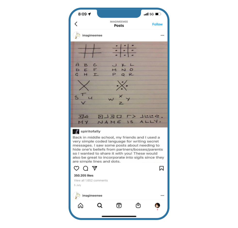
Once I had digitalised the symbols from the screenshot, I lined them up in a sentence to see how it looked (red area). Can you see what I wrote here?
I wasn’t happy with the symbols as they were. I didn’t like the fact that the arrow-looking letters (>) were larger in height (and smaller in width) in comparison to the other letters. Another thought that crossed my mind was that the rounded symbols are not used unless you write digits. I wanted to try and mix up the rounded symbols and the symbols with sharp corners. See the result in the next chapter.
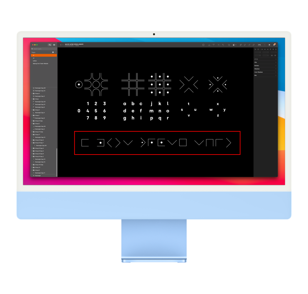
Here’s the symbols with both rounded and sharp corners mixed together into one non-latin alphabet (yet still 26 letters). I was looking for logic in the letters to make them at least somehow understandable and not random, but more about logic in one of the next chapters. To give you a sneak preview, vowels have rounded corners and consonants have sharp corners. Because of the fact that I was still using shapes with an opening on 1 of the 4 sides, this meant that the amount of vowels and the options of the symbol didn’t line up well. That is why I added the letters y and j (i.m.o. sound like vowels) to the range of ‘vowels’. The amount of consonants is very high so once the amount reached the end of one symbol’s option (letter h), a dot is added to the symbol.
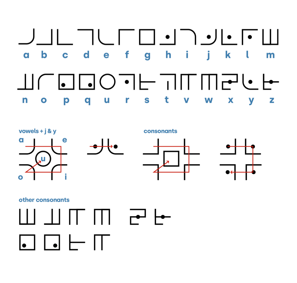
When I figured out a nice base to start from, there were only two elements missing in this non-latin alphabet. Actual symbols like a question mark and semi-colons and capital letters. I wanted to differentiate uppercase letters from lowercase letters to give that extra touch to the script. The rule is the same: every sentence starts with a capital letter and so does every name. The makong-symbol is very easy to recognise. It’s the > symbol pointing to the bottom right, positioned in the top left of every letter.
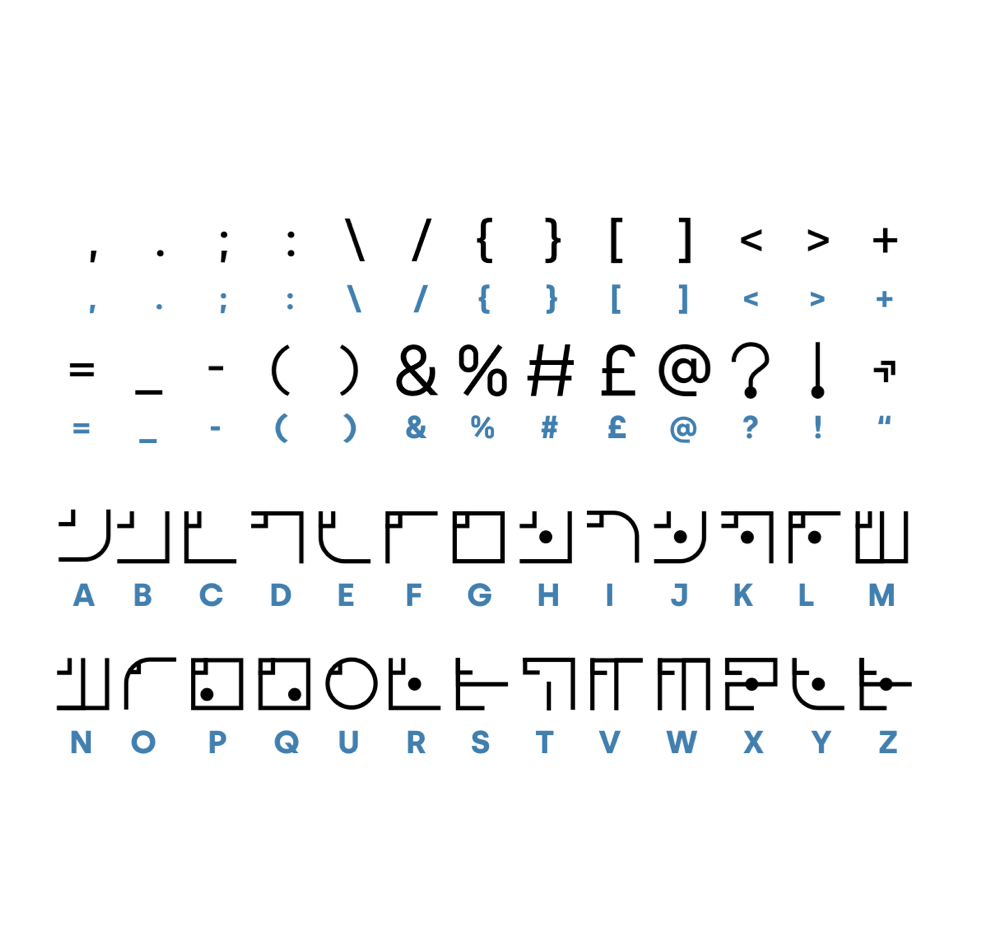
The other symbols I wanted to add are those I mentioned first here. Whether you’re asking a question or you want to make something clear, you use these symbols and to not overcomplicate things, I kept them the same as in latin symbols: {}()-+=:;<>?!@£#&,.
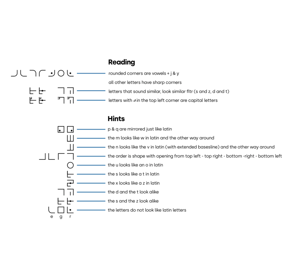
To make the script slightly understandable, there needs to be a logic or pattern in the letters or the order of letters. As I mentioned before, vowels (+ j & y) have rounded corners and all other letters have sharp corners. In the image you see an overview that I created with the logic in reading and some hints to help you get started reading. To give you an example, letters that sound similar look similar. And the p and q in latin are mirrored in makong-script too. And the m in latin looks like a w in makong-script. A little trick - the letter O in makong is actually a u in latin.
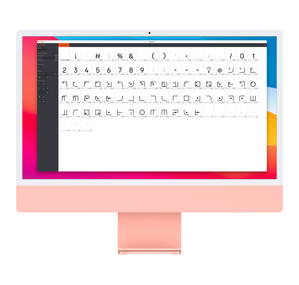
To go from these svg symbols to an actually font you can use to type letters, I used a tool called Birdfont. This tool lets you choose a baseline, the amount of kerning and all other settings you’d want to configure for a font. It supports svg-import (which was a must for me as you understand) and let’s you edit parts of the svg if needed. The output is a ttf-file and is supported by a lot of document writers and also online environments like websites.
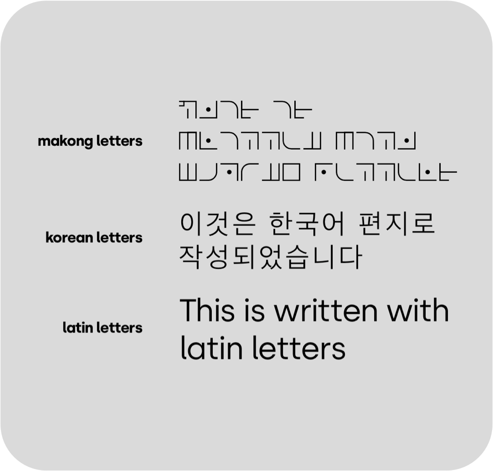
Since these makong-letters are not similar to latin letters in every way, they may let you think of an asian alphabet instead. That is probably because of the lack of a latin reference. In the image I lined up three different scripts beginning with makong, followed by the a korean line and last but not least - a very well known line.
In the process of making this new alphabet, korean - or any other asian script - was not even an inspiration for me but rather to create something that really no one could understand. I suggest to try out the makong script yourself!